Smartly's Creative Suite hero image

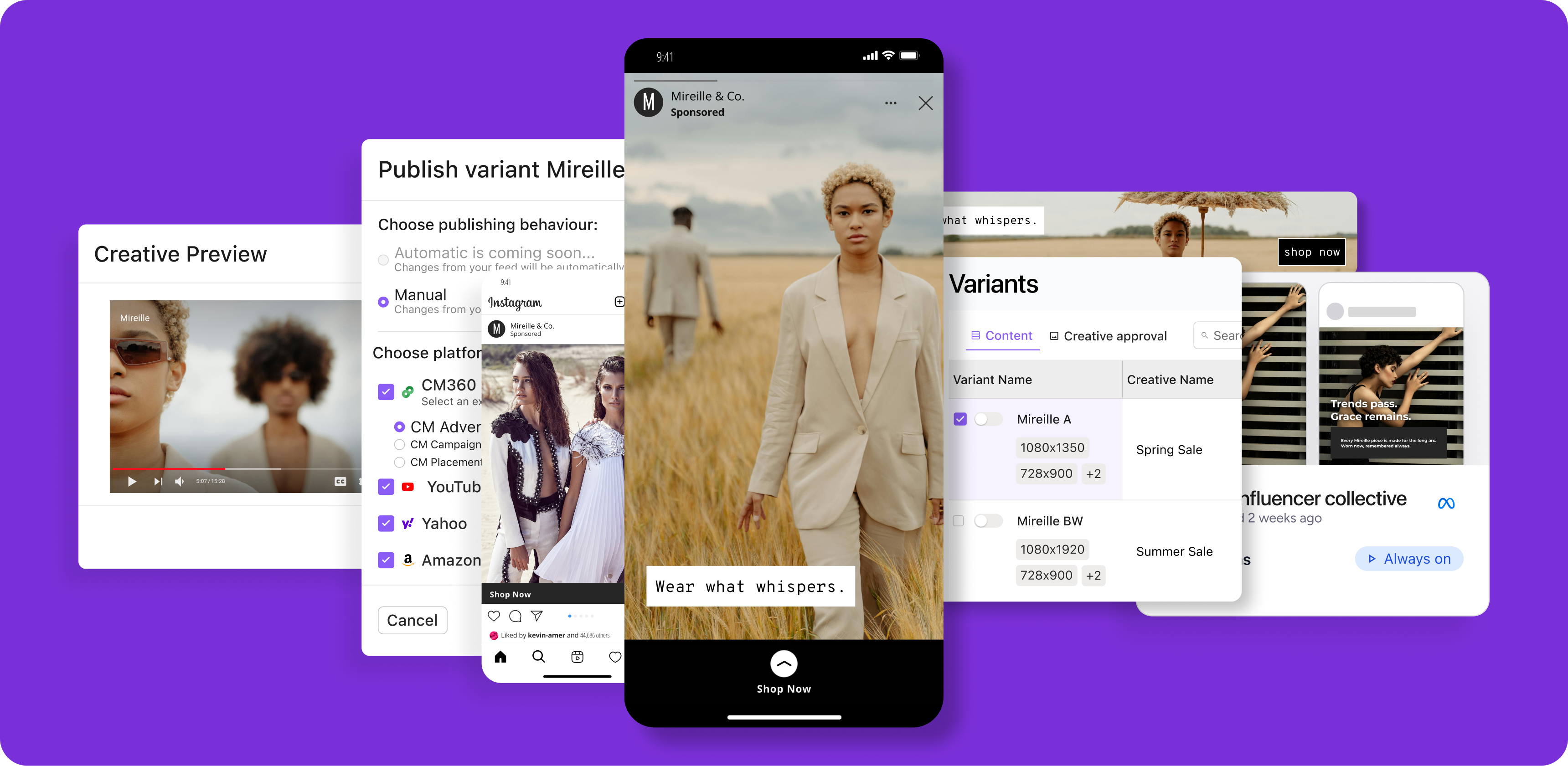
Hero image for Smartly’s Creative Suite, where ad creative and platform features come together through motion on the live site

Clarity through design

Smartly.io is an AI-powered ad tech platform that helps global brands automate and optimize their creative campaigns. During a website refresh, the marketing team needed visuals that could simplify complex features and communicate the platform’s value at a glance.

Company:

Smartly.io

Role

Visual designer

Website:

https://smartly.io

Smartly's Brand Pulse hero image

Hero image for Brand Pulse, Smartly’s tool for real-time, cross-channel measurement and optimization of brand awareness campaigns

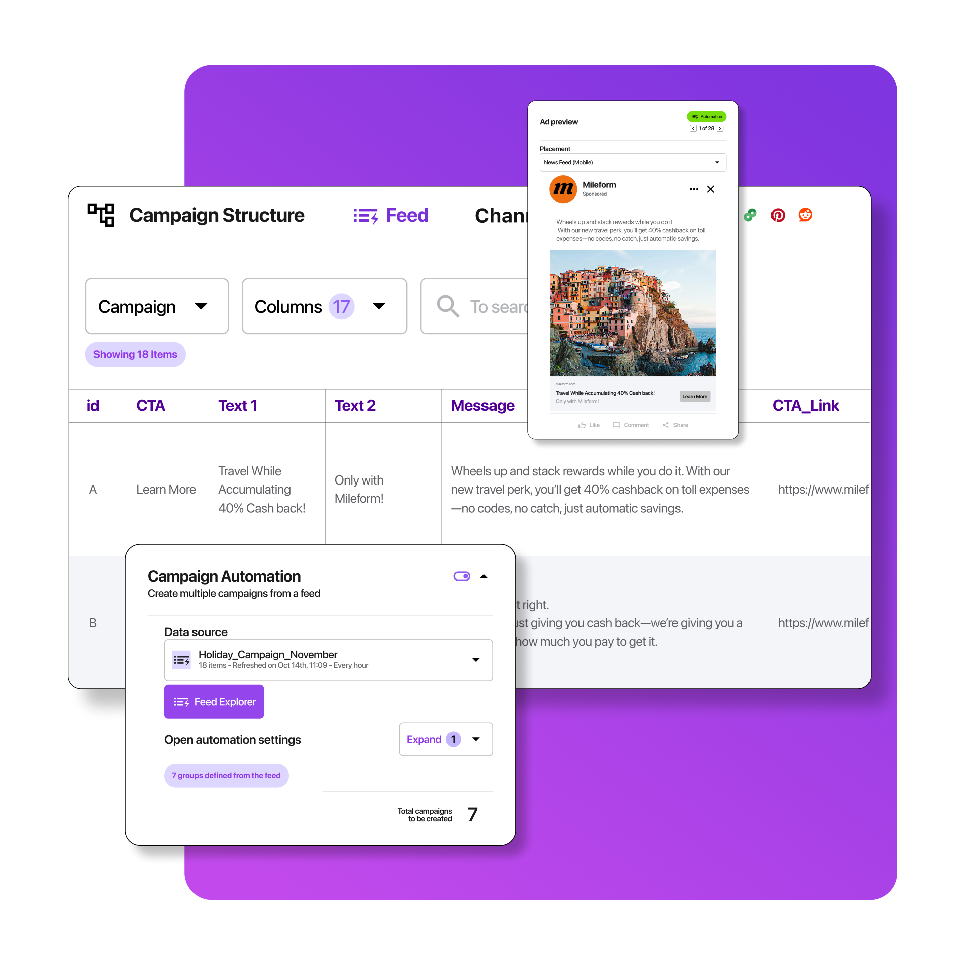
 Smartly Media Suite product feature

Feature representation showing how Media Suite users can automate ad campaigns with dynamic messages, CTAs, links, and images

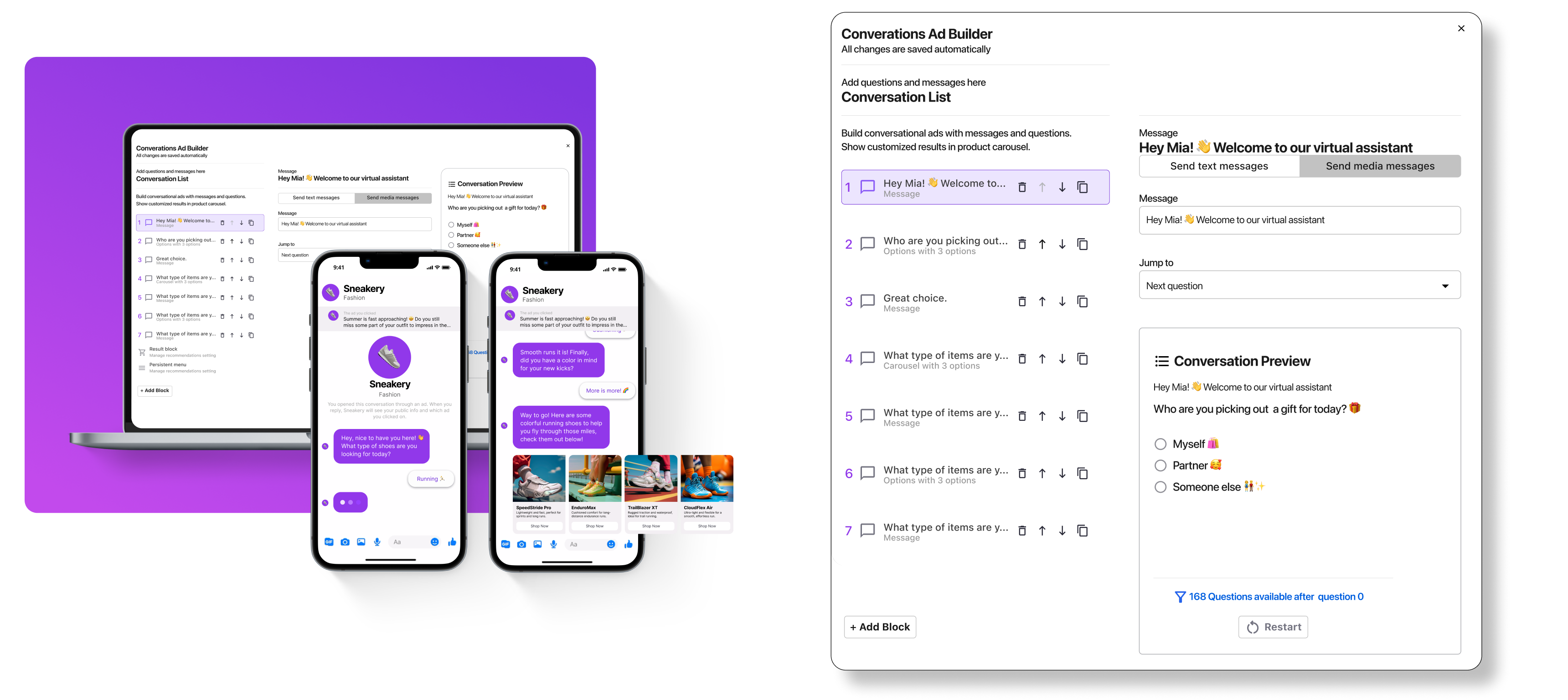
Smartly Conversational Commerce product representation

Simplified product feature for Smartly’s conversational commerce tool, rebuilt to pair seamlessly with a phone-based use case scenario

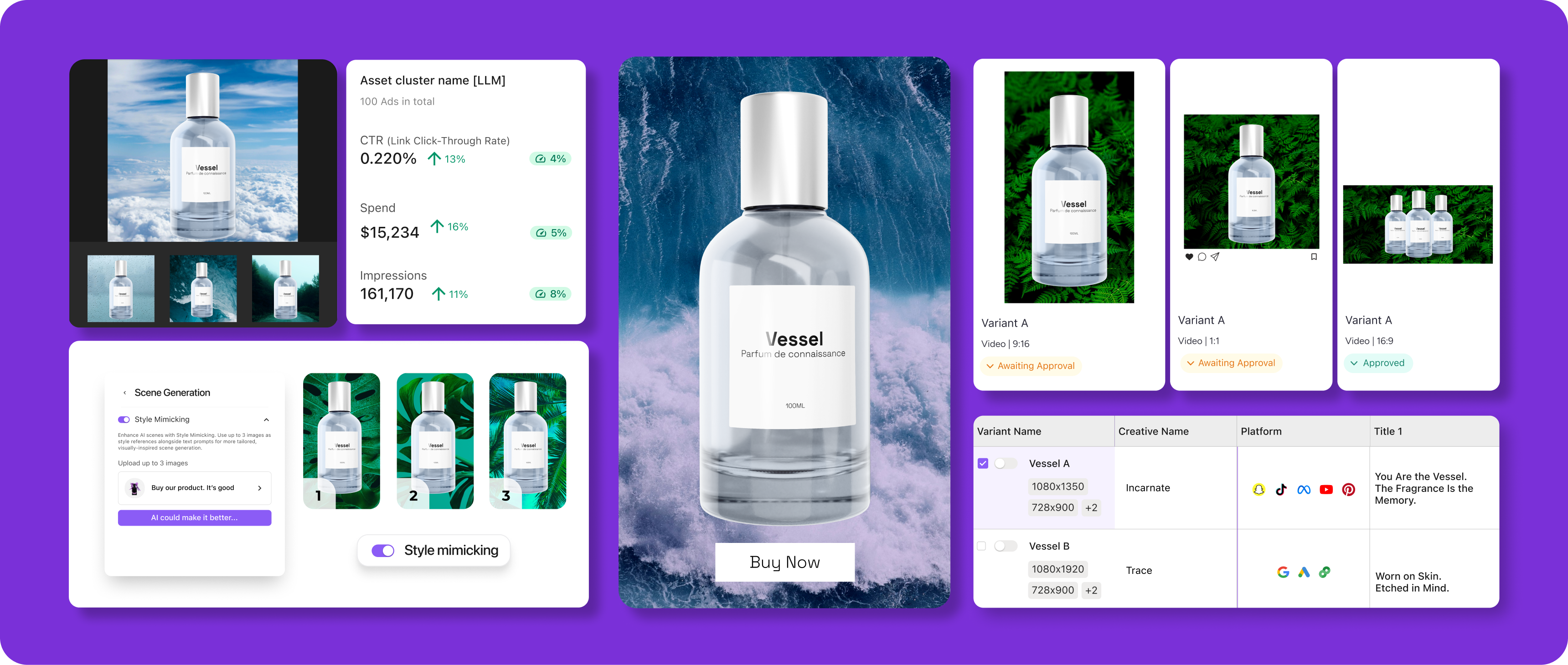
Smartly Ad Creative, AI features

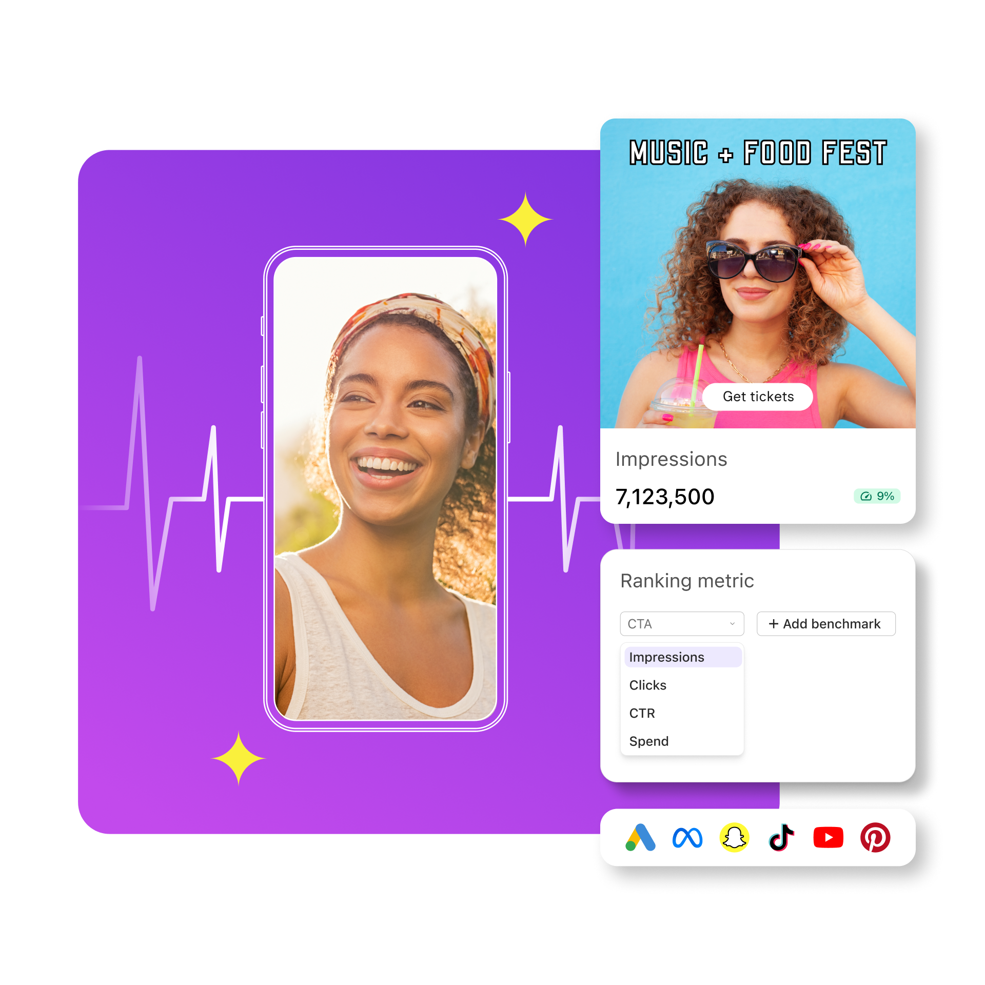
AI ad creative feature visual showing how users can generate multiple product scenes, with performance reports on impressions, spend, and click-through rate

The challenge

The previous Smartly.io site relied on static screenshots and outdated visuals that no longer reflected the sophistication of the platform. For the refresh, a new third-party template was introduced that incorporated parallax effects to create a more polished and modern web experience. The challenge was to design new visuals that complemented this subtle depth, felt cohesive within the new framework, and reflected the premium nature of the Smartly.io brand. The publications portal also needed unification, as inconsistent layouts and styles across reports weakened the overall brand presence.

The solution

I rebuilt the product representations to better showcase Smartly.io’s platform, replacing static screenshots with clean, branded visuals that worked seamlessly with the new template’s parallax structure. These visuals clarified complex product features while adding a sense of dimension and refinement. I also redesigned the publications portal, creating consistent templates and layouts that strengthened the brand’s identity across all materials.
Publication portal with preview images showing cohesive branding

Publication preview templates built for visual consistency across the portal, giving every piece a polished, branded first impression

Process & Impact

Design Approach

Refined existing visuals to align with Smartly.io’s elevated brand direction and new parallax framework. Rebuilt product representations for clarity, depth, and cohesion, ensuring every element supported hierarchy and consistency across the site.

Results

The new visuals clarified Smartly.io’s platform, replacing static imagery with cohesive assets that conveyed sophistication and trust. The publications portal gained consistency, improving usability and reinforcing a unified brand experience.

Lessons Learned

Subtle design choices can make a lasting impact. Working within a structured template proved that balance, hierarchy, and visual consistency can elevate usability and perception more effectively than heavy redesign.

Executive Summary

The Smartly.io website refresh paired refined product visuals with a new parallax-based template to create a cohesive, modern, and credible digital experience. By replacing static imagery and unifying the publications portal, the refresh elevated both clarity and brand sophistication.