Texas Health Steps Medical Professional Pages

Texas Health Steps pages designed with a human-centered lens, highlighting each medical role to create a more relatable and accessible experience across the platform

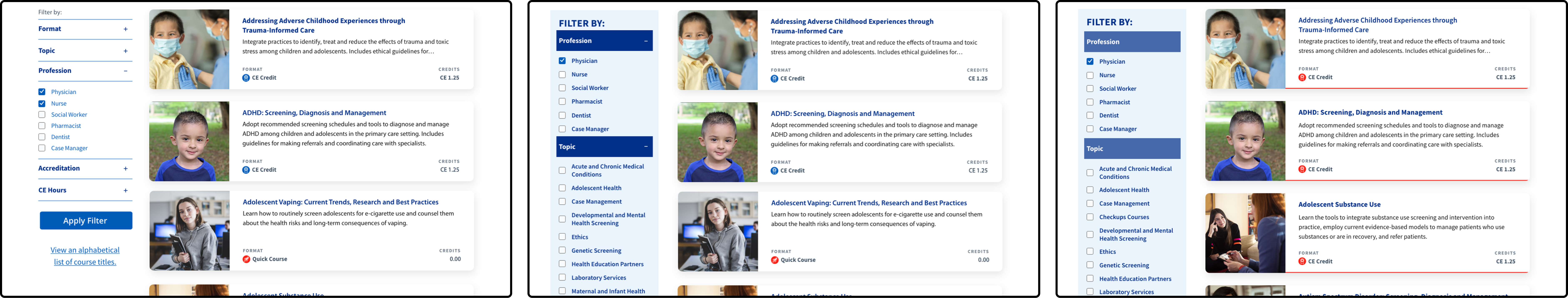
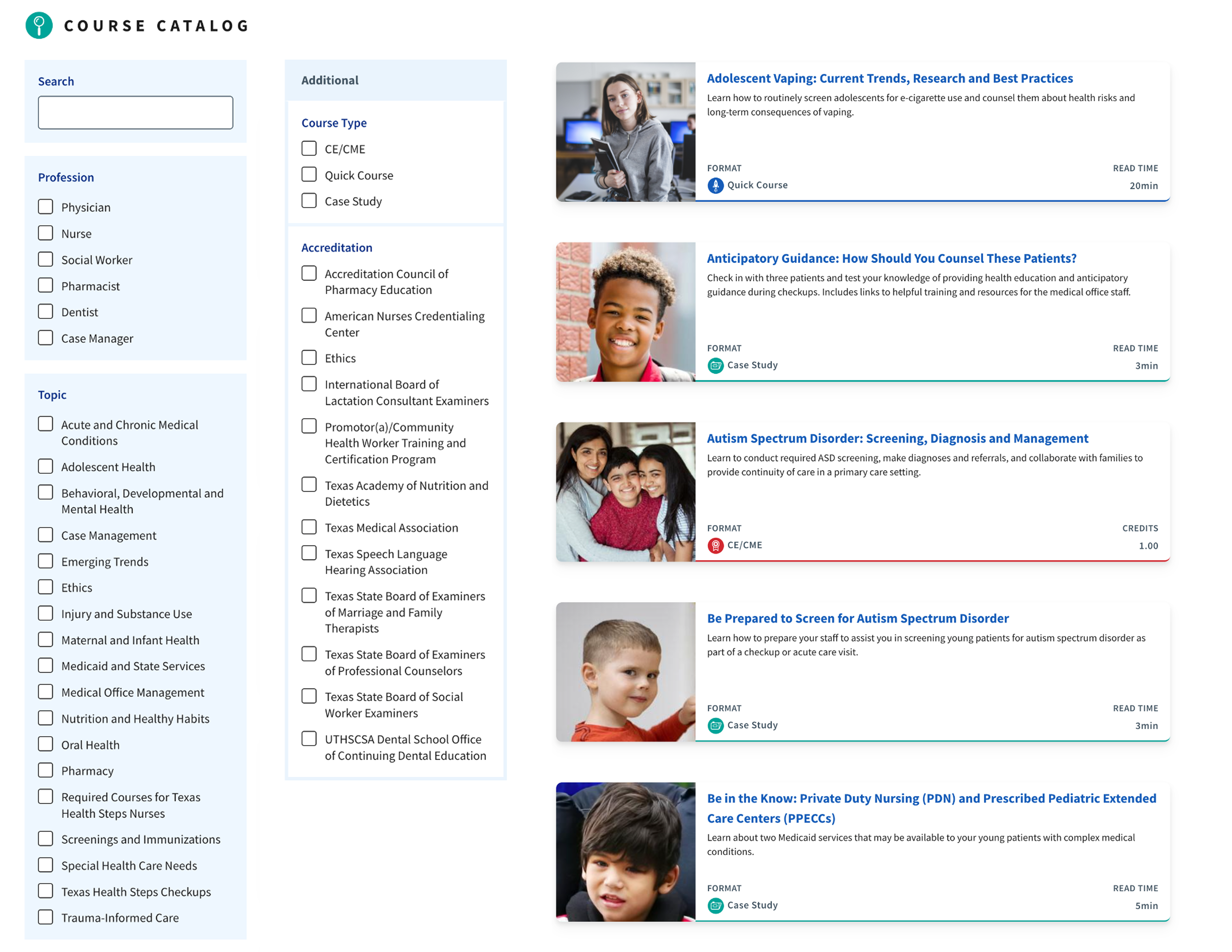
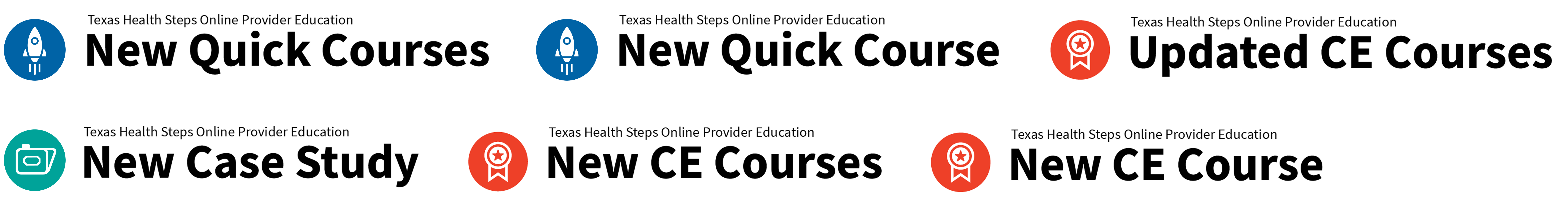
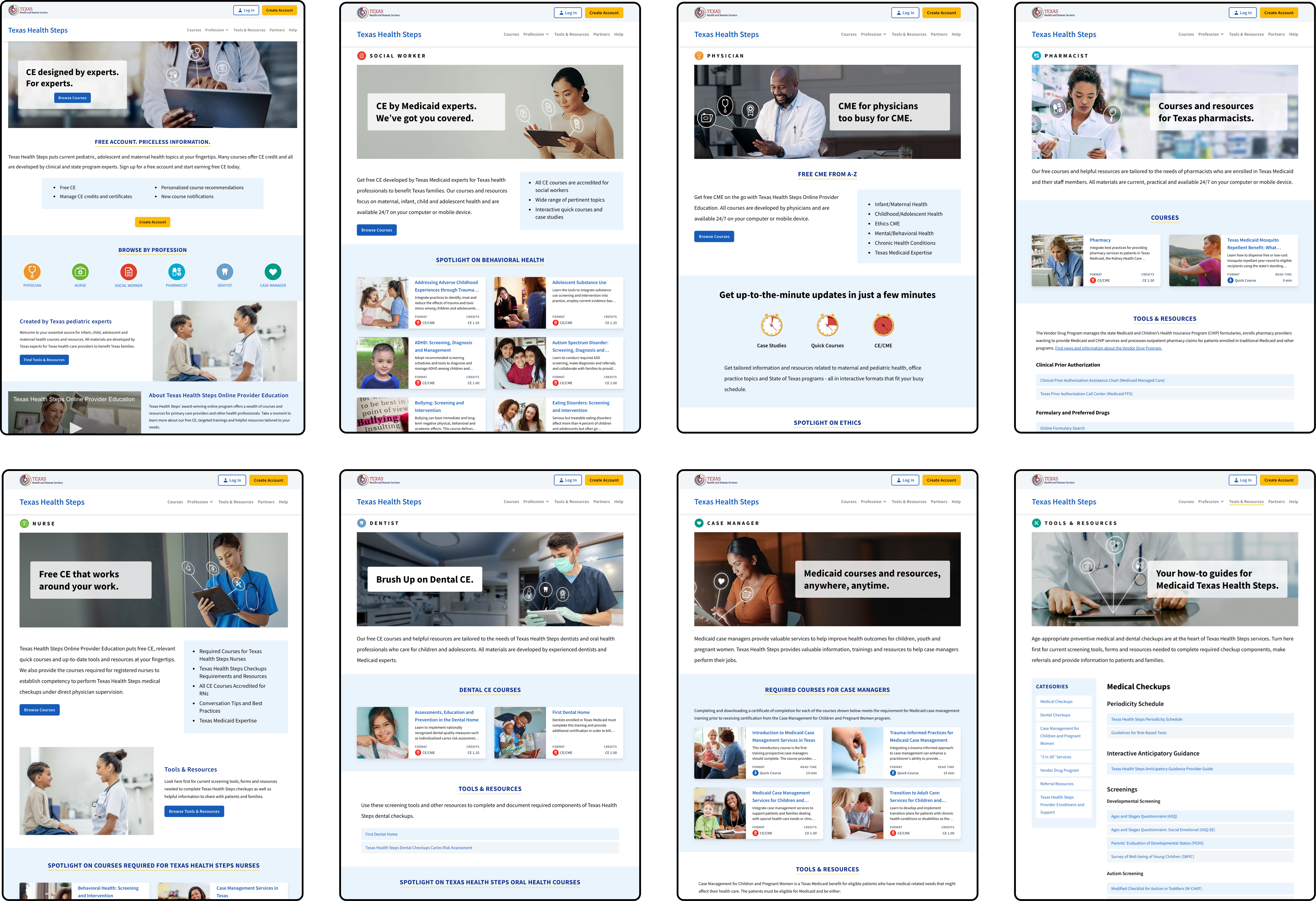
Prescribing a better UX for continuing education

Texas Health Steps is a free continuing education platform for medical professionals, helping them meet licensing requirements without financial barriers. I was brought in to redesign the experience, reduce drop-offs, and make navigation clear, modern, and human-centered.

Company:

Texas Health & Human Services

Role:

Digital Designer

Website:

https://www.txhealthsteps.com/

Tx Health Steps Icons

Refined icon set for Texas Health Steps that laid the foundation for clear information hierarchy and guided users through key content with ease

TX Health Steps Course Finder Testing phases

Three iterations of the course finder filter redesigned to improve usability and navigation, paired with evolving course tiles refined through testing and rapid prototyping to support a more intuitive browsing experience

Biosil Influencer Brochure

Live site results showcasing improved filtering by profession, topic, course type, and accreditation. Course tiles are color-coded by format to help users quickly identify what fits their needs.

The challenge

The previous platform required too many clicks and offered little guidance, leading to user frustration and high drop-off rates. Course discovery was difficult, visuals were outdated, and users often abandoned registration before completion. The challenge was to simplify the flow, improve information hierarchy, and create a structure that supported medical professionals in finding courses quickly and confidently.

The solution

I overhauled the interface to focus on clarity and ease of use. Introduced filtering and sorting tools, color-coded tiles with icons, and clear visual hierarchy to make course browsing intuitive. Built a robust filtering system that allowed users to quickly narrow results by profession, topic, or requirement, minimizing cognitive load and time spent searching. Added dedicated pages for each medical role, featuring representative imagery to help users connect with their field. The design balanced usability and warmth, turning a clinical site into one that felt approachable and efficient.

TX Health Steps Email Banners

Post-launch email banners featuring medical professionals to put a human face to the platform

TX Health Steps Email Banners

Update banners announcing new platform additions, designed to keep users engaged and informed

Process & Impact

Design Approach

Centered on reducing cognitive load. Designed an experience that anticipates user needs, guiding medical professionals through content with smart filtering, clear pathways, and a tone that balances clarity with care.

Results

The redesign created measurable improvement in course discovery speed and engagement. It set a new internal benchmark for how design systems can simplify complex government platforms and scale efficiently.

Lessons Learned

Even small UX refinements can change behavior. By focusing on how users search, sort, and decide, design can turn a required task into a satisfying, self-directed experience that builds confidence.

Executive Summary

The Texas Health Steps redesign transformed an outdated education platform into a modern, intuitive experience. By introducing a robust filtering system, improving navigation, and elevating visual hierarchy, the project helped medical professionals find and complete courses more efficiently.